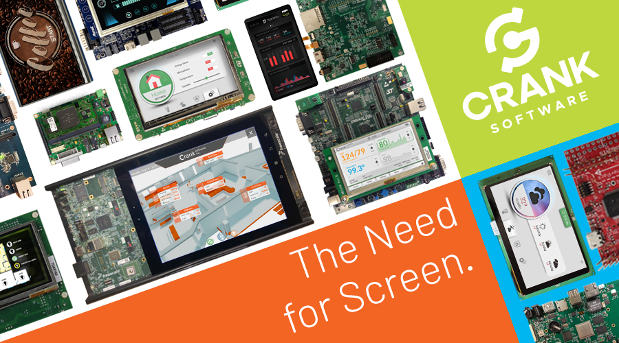
The need for screen: Innovation in embedded GUI development
Crank Software hat heute einen Artikel im Blog veröffentlicht der für alle die sich mit dem Thema der HMI-Design und Entwicklung für embedded Systeme befassen sehr interessant ist.

Back in 2000 when LG introduced the world’s first Internet-enabled fridge, it came with an electronic pen, data memo, video messaging, and scheduler, all made accessible through an LCD “information window”.
This fridge was one of the first examples of a smart appliance with a digital screen but its hefty price tag of $20,000 meant it had anything but mass market appeal. Today, almost two decades later, some of the world’s biggest consumer electronics companies are rushing to put screens back into household appliances – only this time at price points most everyone can afford. There are a few reasons for this but most come down to one: People like the user experience they offer. Millennials in particular (now the largest generational group in the US) are very comfortable and familiar with display screens and are creating a demand for all manner of products with them. Aside from the fact that we all spend a good chunk of our days staring at screens both big and small, we generally regard a product with a display screen as being of greater value than a product without a screen. There are four main reasons for this.
Modernity. Products that have a segmented LCD display look antiquated, especially when they’re sitting next to a full-color LCD microdisplay, and consumers expect their new devices to have modern features. It’s tough enough for your product to fight against its competitors but it’s doubly difficult if it looks like it was built in the 90’s.
Capacity. Somewhat paradoxically, a device with more buttons often does less. By streamlining the user interface and creating a simpler, more consistent design through a color display, your product doesn’t have to festoon itself with buttons to control it or LEDs to communicate state. Consumers recognize that flexibility too and assume that the product with a color display usually does more than one without – even if it doesn’t.
Simplicity. The blinking twelve problem, which began with the VCR, still refers to features in products that are unusable due to the complexity of the interface to them. Consumers who were once willing to let their products blink “12:00” rather than figure out a complicated interface are far less tolerant today. Thankfully an intuitive UI based on a full-color LCD makes it simple for users to program today’s increasingly complex consumer electronics products.
Elegance. Aesthetics play an important role in how a product is perceived. Researchers at Hitachi first demonstrated the aesthetic-usability effect in a study that showed how people perceive more aesthetically pleasing designs to be easier to use than their less pleasing counterparts. Visually rich interfaces are therefore worth their weight in gold when creating a positive user experience for your product.

Small-connected devices are expected to explode in popularity over the next two years. The total addressable smart home appliance market alone is forecast to be close to 700 million units worldwide by 2020. Give your product an intuitive interface and a visually rich screen, and you’re giving it every chance to be at the top of its category – regardless of your market.
Check out our latest e-book where we explore this and many other related topics on how to build your next killer product.


